- Color Psychology
- User Experience
- Web Design
- Brand
The Psychology of Color in Web Design – Design, Emotions, and Trust

Per Starke
Last updated: 22/08/2025
Approx. 4 min read
The Psychology of Color in Web Design – Design, Emotions, and Trust
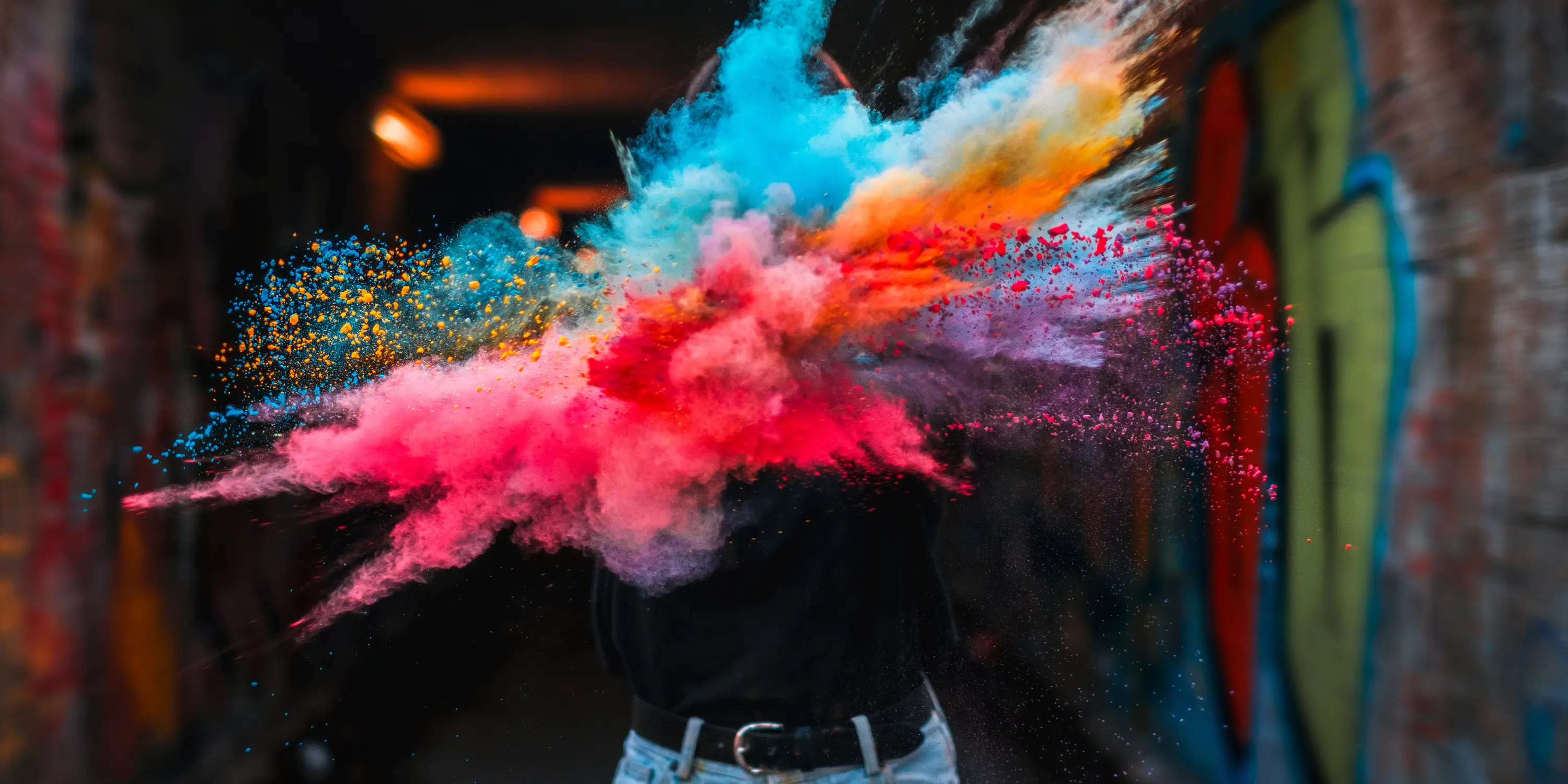
Color choices in web design aren't just about aesthetics – they influence emotions, trust, and user behavior. A well-chosen color scheme can make a website feel professional, welcoming, or energetic. Poor choices, on the other hand, can create confusion or even push visitors away.
Let’s take a look at how color psychology shapes user experience – and how to use color intentionally in your website design.
First Impressions Matter – The Power of Color
Color is one of the first things people notice when they land on a site.
It creates emotional associations instantly – often before visitors read a single word.
Think of brands like Telekom or IKEA:
Colors like Magenta, Yellow, and Blue immediately create recognition and emotion.
The same principle applies to your website. When used with intention, color builds familiarity, evokes trust, and supports your overall message.
The Psychology of Colors – What They Communicate
Different colors carry different emotional weights. Here's a quick overview of what common colors typically communicate:
Blue
Trust, calm, professionalism. A safe and widely used choice. But overused blue can feel cold
or distant.
Red
Passion, urgency, attention. Works well for CTAs, but too much can feel aggressive.
Yellow
Warmth, optimism, energy. Great for drawing attention – but use it with care, especially on
bright backgrounds.
Green
Stability, nature, balance. Ideal for eco-focused brands or areas where reassurance matters.
Orange
Friendly, approachable, energetic. Often used to express accessibility or movement.
Purple
Creativity, luxury, depth. Adds a touch of elegance or uniqueness when used well.
Gold, Gray, Black
Gold = exclusivity, Gray = neutrality, Black = sophistication or bold modernity.
All are powerful, but too much black or gray can feel heavy or impersonal.
Color is a silent communicator – and it speaks volumes in milliseconds.
Real Example: The Color Strategy Behind Our Website
For the PSWD website, we use a modern, minimal color system that reflects who we are: professional, focused, and quietly confident – with room for energy and personal connection.
Our primary background color is PSWD White, which gives the entire site clarity and
openness.
It’s clean, simple, and makes space for the content to breathe.
The secondary color, Mirage, adds contrast and depth. It’s a dark blue-gray that feels grounded, calming, and modern – perfect for creating structure and visual balance.
Our core accent is Electric Blue. We use it intentionally to highlight key actions and moments – it’s bold, clear, and instantly attention-grabbing. It brings focus and a sense of innovation without ever feeling pushy.
To add flexibility, we also use a subtle system of supporter and highlight tones, including soft blues, warm neutrals, and a vibrant yellow-green. These colors allow us to shift tone where needed – from technical to energetic, from minimal to expressive – without ever breaking brand cohesion.
Want to see how it works in practice?
Click through this website and notice how the
colors guide your experience – from visual
clarity to focused CTAs.
Common Mistakes in Color Use
- Clashing combinations
Some color pairs just don’t work together. They distract and confuse instead of guiding attention. - Low contrast
Readability comes first. If users can’t read your text easily, they’ll leave – no matter how “on brand” the colors are. - Too many colors
Stick to a core palette. Too much variation weakens consistency and overwhelms the design. - No strategic purpose
Color shouldn’t be chosen just because it “looks nice.” It should serve a message or feeling that matches your brand.
Conclusion
Color isn’t decoration – it’s strategy.
It shapes how your brand feels, how users navigate your site, and whether or not they trust you.
That’s why we always design color systems with intention. Because the right palette doesn’t just look good – it helps your website perform better and builds trust from the very first second.
Ready to rethink your colors or refine your brand visuals?
Let’s make it happen – together.